The new “Office for Mac 2011” icons are stunning and sophisticated.Microsoft has engaged the help of company called Frog Design to help them create a new line of icons for their 2011 version of the Office for Mac.With the help of grids and pen tool, it is really not that hard to come up with a similar design. This tutorial will capture the essence of the icons.


Grids and Circles
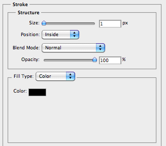
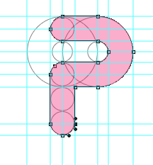
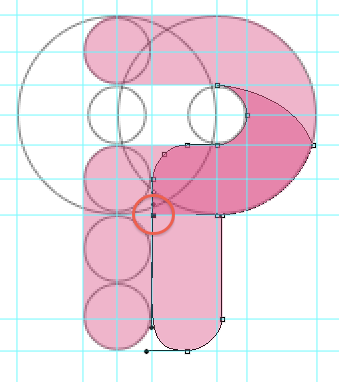
Step 1: Create a 100px X 100px circle. I drew the circle with the help of grid-lines. Set vertical grid lines at 150px and 250px and horizontal grid lines at 150px and 250px. Name the layer “Circle”. Give it the layer properties as shown below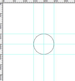
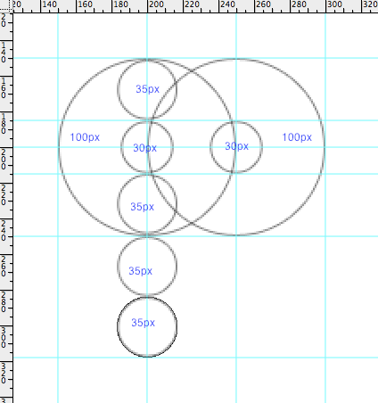
Step 2: Set another vertical grid line at 300px and 350px. Duplicate the ‘Circle’ layer and move the circle until it’s center is at the 300px gridline. Do this for the rest of the circles in the illustration below. Use gridline to help u achieve accuracy.
Pen Tool
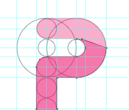
Step 4: Use Pen tool and start plotting the points according to illustration below. Name the layer ‘P-bright’.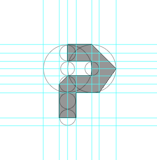
Creating the rounded corners
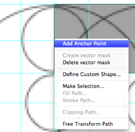
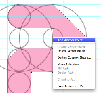
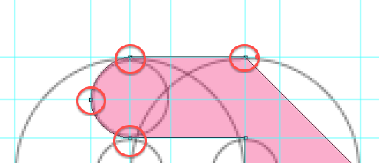
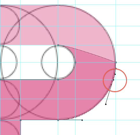
Step 5: A very easy technique that i always use to create a rounded corner are as follow:- Add anchor point.
- Use ‘Direct Selection Tool’ to drag the point to create some curvature.
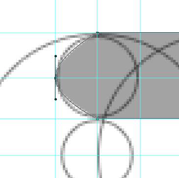
- Use ‘Convert Point Tool’ on the two handle bar to increase the curvature until it forms a nice rounded corner.
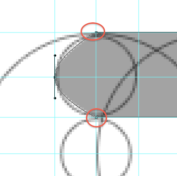
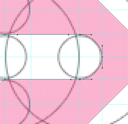
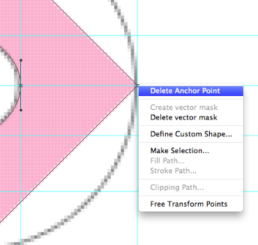
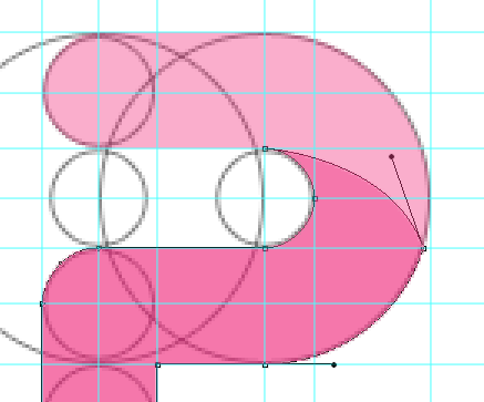
Step 6: Apply this technique to all the corners that need rounding except on the exterior side of the “P”. For that side, you will need to delete the existing anchor point there first before applying the above technique to round it.
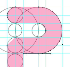
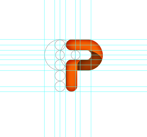
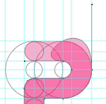
This is what you will get after rounding the corners. The basic shape of the icon is done. What we will need to do now is to give it some depth.

Giving Depth
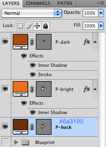
Step 7: Duplicate the ‘P-bright’ layer and rename it ‘P-dark’ layer. Make sure it is on top of the ‘P-bright’ layer.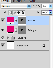
Step 8:Delete the anchor points that are shown below and adjust the handles to get the desired shapes
Step 9:Add another anchor point and delete the other anchor point as shown in the diagram. Adjust the handlebars again to get desired shape
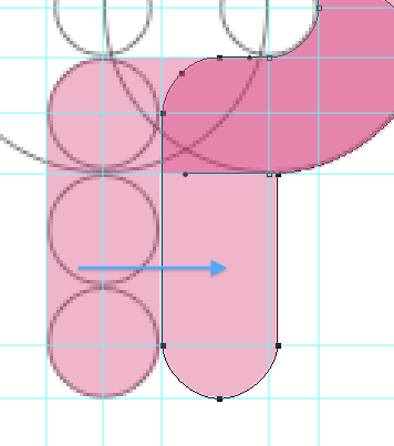
Step 10: Select the anchor points that made up the tail of ‘P’ and shift them to the right.Add another anchor point before deleting the bottom anchor points to get the shape shown in the illustration below
Color
Step 11:Fill up ‘P-bright’ layer and ‘P-dark’ layer with respective colors.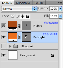
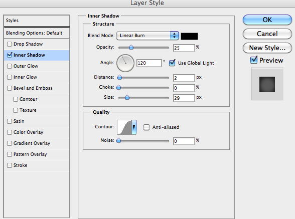
Step 12: Adjust the layer properties of ‘P-bright’ layer.
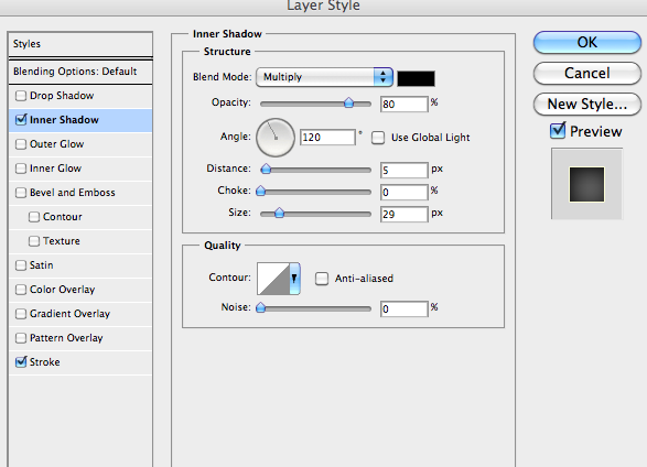
Step 13:Adjust the layer properties of ‘P-dark’ layer
This is what you will get so far. Pretty sweet eh.

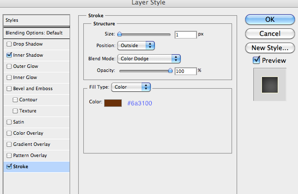
Step 14: Duplicate the ‘P-bright’ layer and rename it ‘P-back’. Move it below ’P-bright’ layer.Fill up the layer with the color stated in the picture.
Step 15:Nudge the ‘P-back’ layer to the left by pressing the left key twice.
Your ‘P’ icon is done!